Skip to content
  • View menu
  • View sidebar

Gather

  • Project Updates
  • About Gather
  • Target Audience
  • Visual Design & UI
  • Prototype
  • Final Thesis Book
  • Midpoint Proposal
  • Portfolio
  • LinkedIn Profile

Archives

  • August 2015
  • July 2015
  • June 2015
  • May 2015
  • April 2015
  • March 2015
  • February 2015
  • January 2015
  • December 2014
  • November 2014
  • October 2014
  • September 2014
  • November 2013

Meta

  • Log in
February 22, 2015 by AndrianaArt

Logos Part Duex

  • Thesis Project
  • logo, logotype

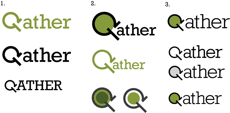
Another round of logo critique and designs. I am focusing on the capital “G” as the search icon, I tried it with a lowercase “g” but it looked too much like a “q” and was confusing. I am leaning towards the simple logotype (#1) with no color inside the “G” but we will see how my classmates and others critique this round.

logos_partduex_Garcia

Post navigation

← Previous Post Final Moodboard
Next Post → Journal

MFA Thesis Project | Web Design & New Media | The Academy of Art University


Loading Comments...
 

You must be logged in to post a comment.