Another round of mockups has been created to reflect the changes made after user testing and to better match the jQuery Mobile icons and buttons. I have created a click through prototype in InVision which can be viewed here: http://invis.io/ZG2V4H8EP
Month / April 2015
Journal
Goals:
- make changes to prototype and mockups based on user feedback
- update mockup pages with interactions for my thesis book
- update functional prototype to better match mockups and try to get rid of that pesky text shadow in Chrome
- practice job interview questions
Issues covered/Response from advisor:
- be mindful of my text sizes and layouts on smaller screens
- learned how to position div tags in layers using z-index
Goals for next week:
- begin to build Javascript/jQuery interactions in CodePen and then into my prototype for the map and active search filter counter
- add final mockups, create logo & type pages for my thesis book
- continue to do user testing with UsabilityHub, this time a Click Through test
User Testing
Now that I have some significant changes on my new round of mockups and my prototype I wanted to do some quick user testing to see where I stand. I conducted a couple simple tests on UsabilityHub.
#1 Two part Click Test on where users would click to find a product on the store map.

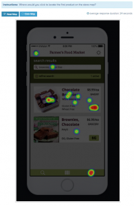
The results showed me that the majority of users were split between the map icon in the footer and the aisle # button, and that they were unable to locate the aisle button unless it looked like a standard light green button. I think I could make the Aisle button stand out more by making it larger and calling it “aisle 2B”.
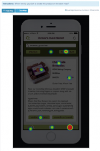
#2 What is Gather test? Users were told “Imagine you are at a grocery store shopping around for dinner.” and then asked what they thought the app was for while being shown an image of the homepage.

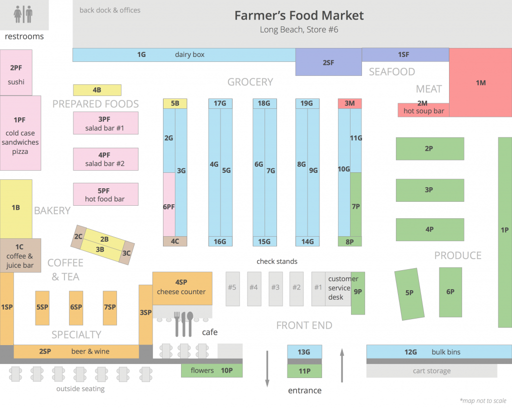
I learned that many users didn’t read the prompt in the beginning, not surprised after teaching high school for so long, lol. In hindsight the prompt would give users too much of a clue so having their responses without it is better in the long run. I found out that the store name at the top of the page was confusing users about what my application did. A few of them thought it had to do with Farmer’s Markets, unfortunately I can’t use a real grocery store’s name so I just put in some placeholder text to clear up any confusion.
Journal
Goals:
- Begin user testing of prototype
- Finalize mockups and document user interactions
- Build all steps necessary to complete user flows in for InVision prototype
- Practice interviewing techniques and communication style
Issues covered/Response from advisor:
- need to user test and get user feedback on whether or not my back/next buttons make sense on the map and product pages
- researched material design & iOS 8 interaction styles
Goals for next week:
- make changes to prototype and mockups based on user feedback
- begin building store map features for functional prototype
Mockups with Interactions
For this last round of mockups, I added a lot more screens and described the interactions between them in detail. Doing so brought up some usability and visual issues I had yet to really deal with. For example, on the map page I have “back” and “next product” buttons which made perfect sense at the time but now seem kind of odd. I’m going to have to re-visit the functionality of them and see if they still make sense. I am displaying all the search results on the map anyways so when would users need to see the next product?
Journal
Goals:
- figure out the rest of the map interactions like zooming, and containing the map to it’s edges
- make changes to mockups based on prototype issues, add more descriptions
- set up new walkthrough prototype for user testing focusing on searching & finding products
Issues covered/Response from advisor:
- Figured out solution for interactive interior map, D3js.org, commonly used for infographics
- Layout needs tweaking to better fit small mobile screens
Goals for next week:
- Begin user testing of prototype
- Finalize mockups and document user interactions
- Build all steps necessary to complete user flows in prototype
Store Map Update
This week I focused on completely re-doing my store map and layout. I went back to my model store to gather more details and I ended up adding a lot more shelves like end caps (products at the end of the aisles) and products that are normally out front of the store along with more detailed aisle descriptions. I feel like the static version of the map is a lot more usable now.

Journal
Goals:
- redesign my store map and go over mockups again
- practice presenting a project and writing stronger cover letters
- work on prototype, more style customizations & interactions
Issues covered/Response from advisor:
- need to make my cover letter relate to what I can do for the company I’m applying for, less about me
- map should include icons for common areas like the restrooms and cafe
- working out how to create my own interactive map using CodePen: http://codepen.io/AndrianaArt/pen/RNOzWp
Goals for next week:
- figure out the rest of the map interactions like zooming, and containing the map to it’s edges
- make changes to mockups based on prototype issues
- set up new walkthrough prototype for user testing focusing on searching & finding products
You must be logged in to post a comment.