The coded Prototype version of Gather has been updated with changes from the last round of user testing. Added inventory availability, converted the aisle buttons to “view on map”, and did some design cleaning up. The screen capture was done using Quicktime and an iPhone 6 Plus.
Author / AndrianaArt
New Concept Video
User Testing
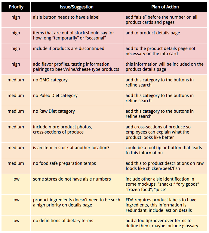
Testing went really well overall and I received a ton of valuable advice and comments from my users. I was able to test with 4 users total, all who worked at specialty stores in my desired demographic. The comment that I received from almost every user was that I need to include more information on the Product pages to make them even more useful for employees. Information on availability, seasonal, discontinued items, and flavor profiles.
User Task & Visual Design updates
For the final round of user testing I have added a few things to the visual design and tightened up my mockups. I need to work on getting the prototype up to speed but I want to do that after I have my user testing completed.
Product Cards now are full width of the screen, allowing more room for product information and larger images.
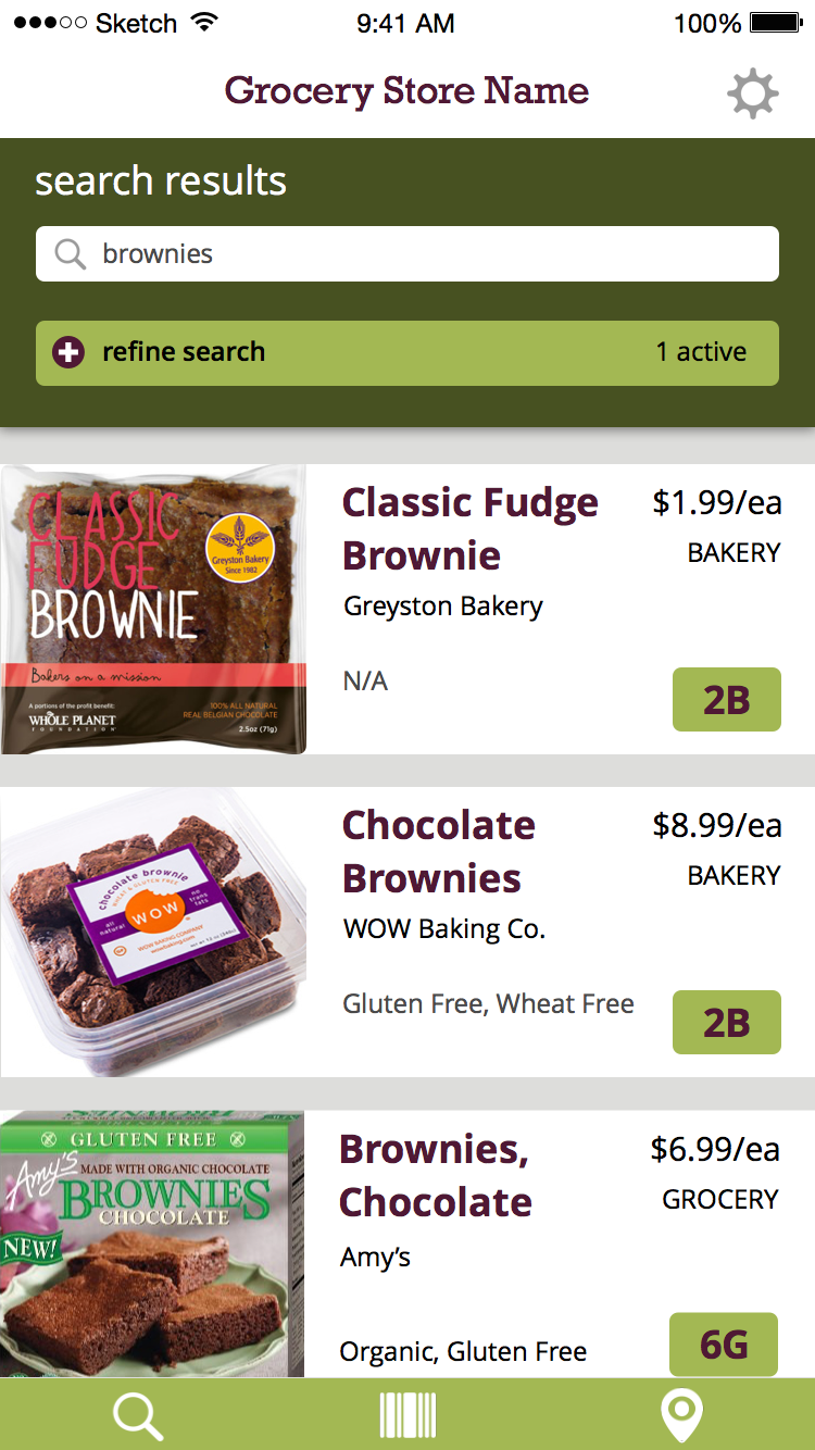
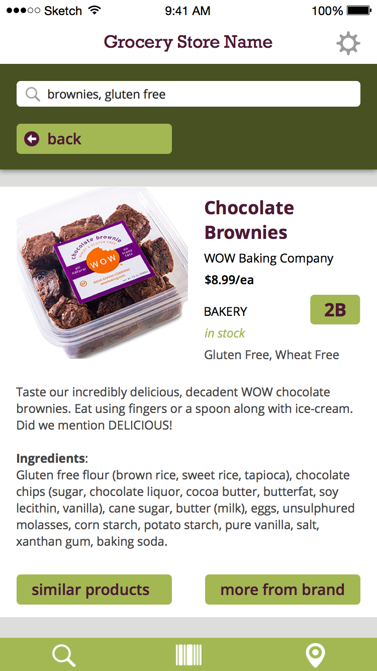
Product Detail Pages are full width as well and now includes if the item is in-stock or not. Still debating if this should be included on the product cards as well.
Journal
Goals:
- get rough draft of thesis book competed and proofread (minus user testing/conclusion)
- re-write tasks for testing with users next week
- do some click-tests on UsabilityHub for the map/aisle button
- complete separate portfolio PDF & Thesis Abstract
Issues covered/Response from advisor:
- final prototype needs to show my three main tasks
- technology used needs to reflect the final app technology and not the prototype
Goals for next week:
- document user testing, take photos, make final changes based on feedback
- get closer to a final draft of thesis book, add in user testing sections
Tightening Up User Flows
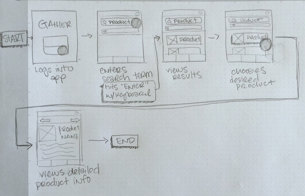
UX Round two has been a great experience and has given me a chance to really get my head around where my application is going and how to fine tune the final presentation. My updated storyboard sequences are below. I received some great advisement from my instructor on how to tie these all together with my user flows, testing tasks, and final prototype.
Andriana, these are good sequences. Add the stories into use stories in your presentation, flow it out, show how it works on site map, and finish off with the working prototype. -UX Instructor
Storyboard 1: Log into app and gather detailed product information.
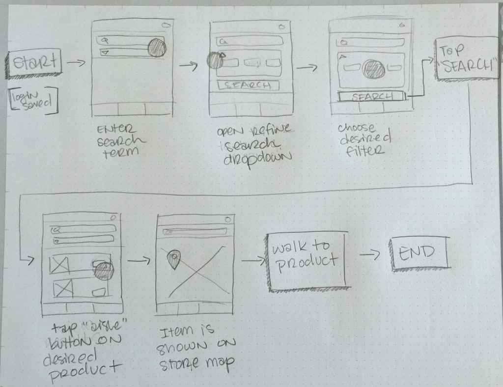
Storyboard 2: Using search filters and finding product’s location in the store.
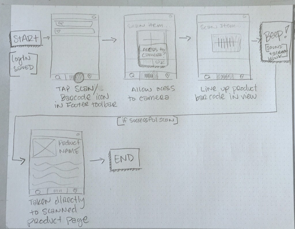
Storyboard #3: Scanning product in hand to quickly access more information.
Journal
Goals:
- solidify site map and information architecture documents
- put together and present midterm/practice presentation
- rough draft of thesis book for review to workshop course
- update materials and images on portfolio website
Issues covered/Response from advisor:
- my project has a lot of scalability to other types of retail outlets and stores
- make sure my site map is complete, clues are in the prototypes
Goals for next week:
- make changes to thesis book layout based on feedback
- finish updating portfolio website layout/interactions
- update resume
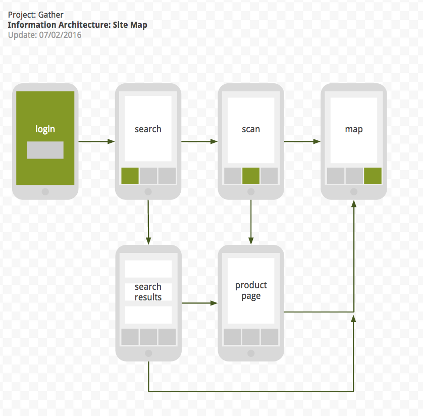
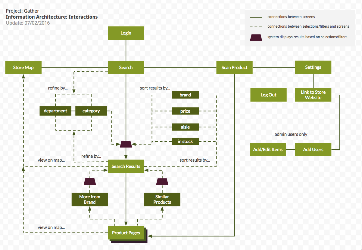
Information Architecture Revised
Based off my prototype work and advise from instructors I have revised my information architecture to more accurately reflect how my application is organized. Technically, I don’t need to include the sorting/filtering options because they are not screens or pages but I feel like they are necessary for me to give an overview of how my application would function. So I have created two separate site maps, one that showcases the interactions and one that is simply the screens seen by the user.
You must be logged in to post a comment.