User Task & Visual Design updates

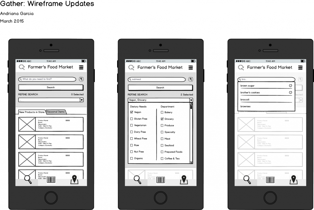
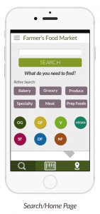
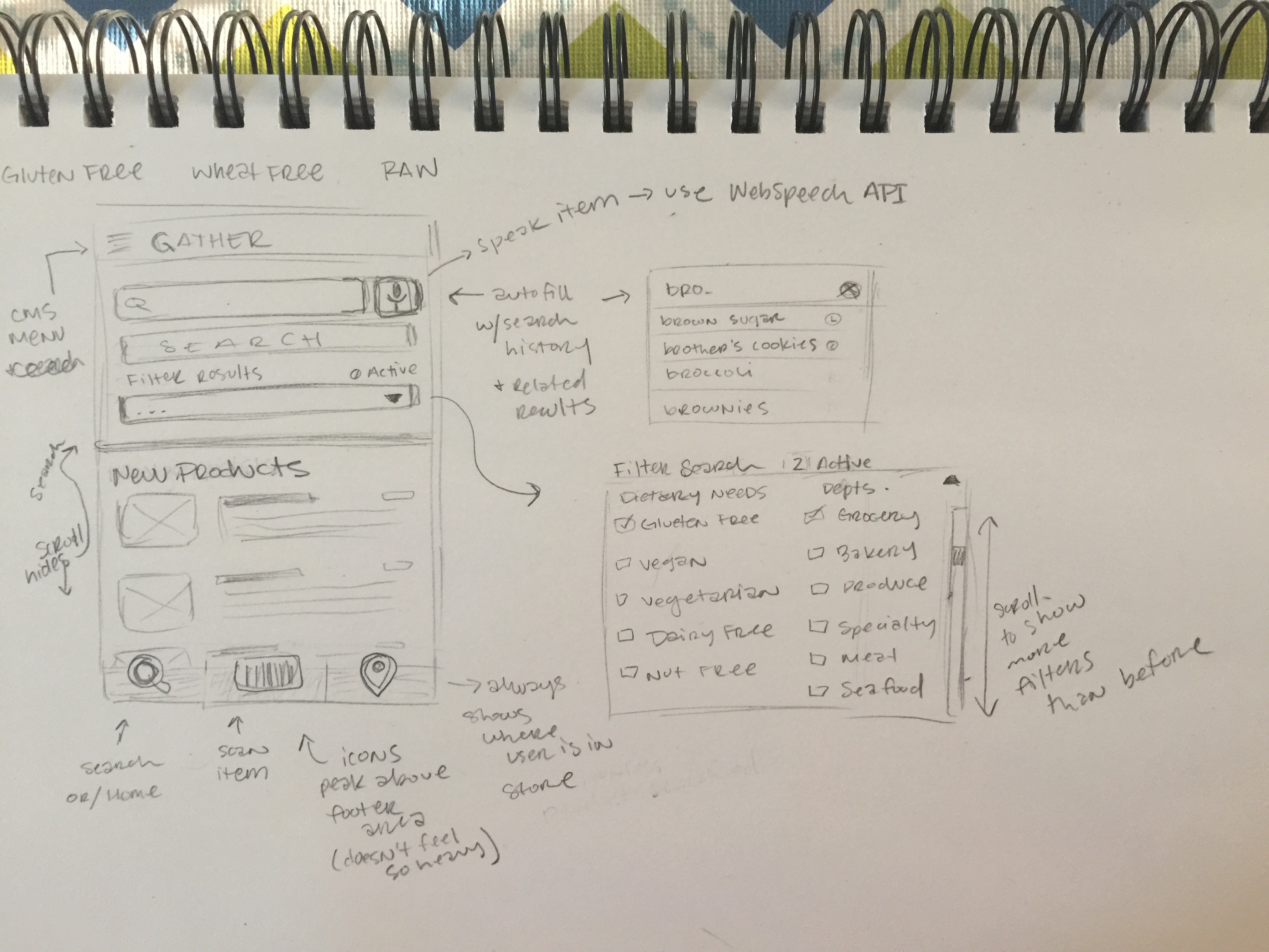
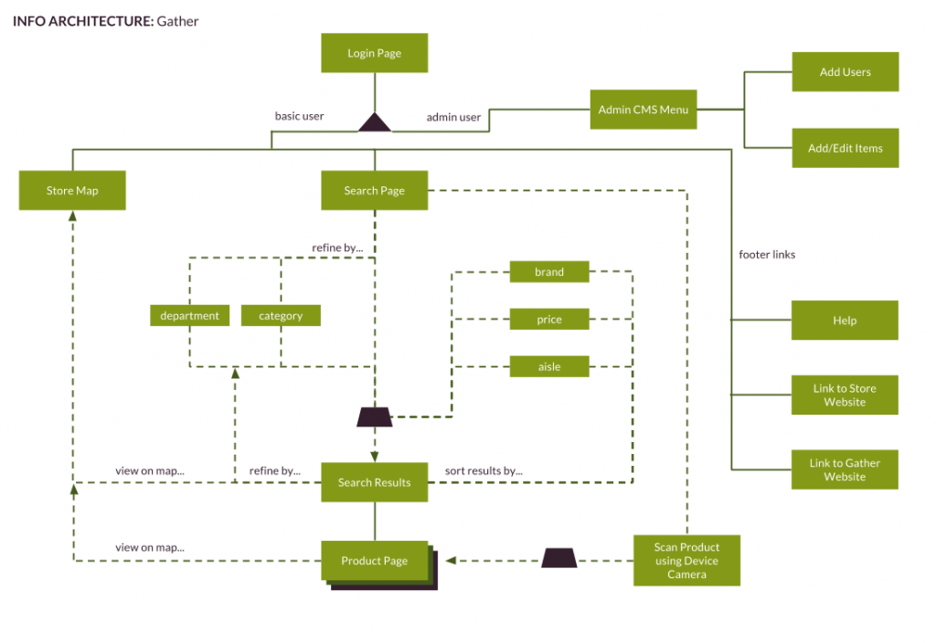
For the final round of user testing I have added a few things to the visual design and tightened up my mockups. I need to work on getting the prototype up to speed but I want to do that after I have my user testing completed.

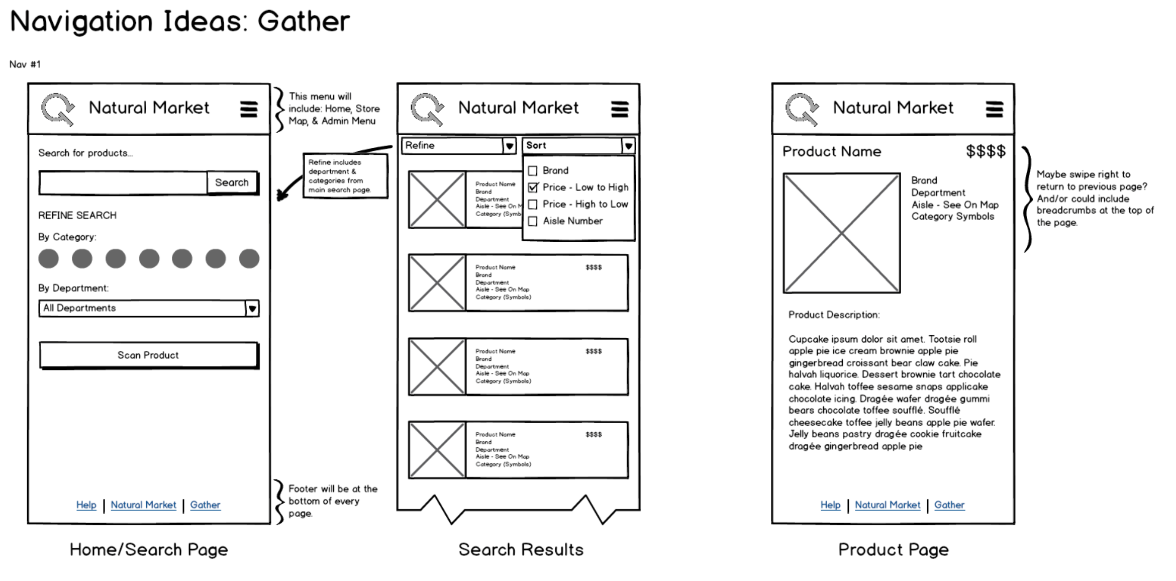
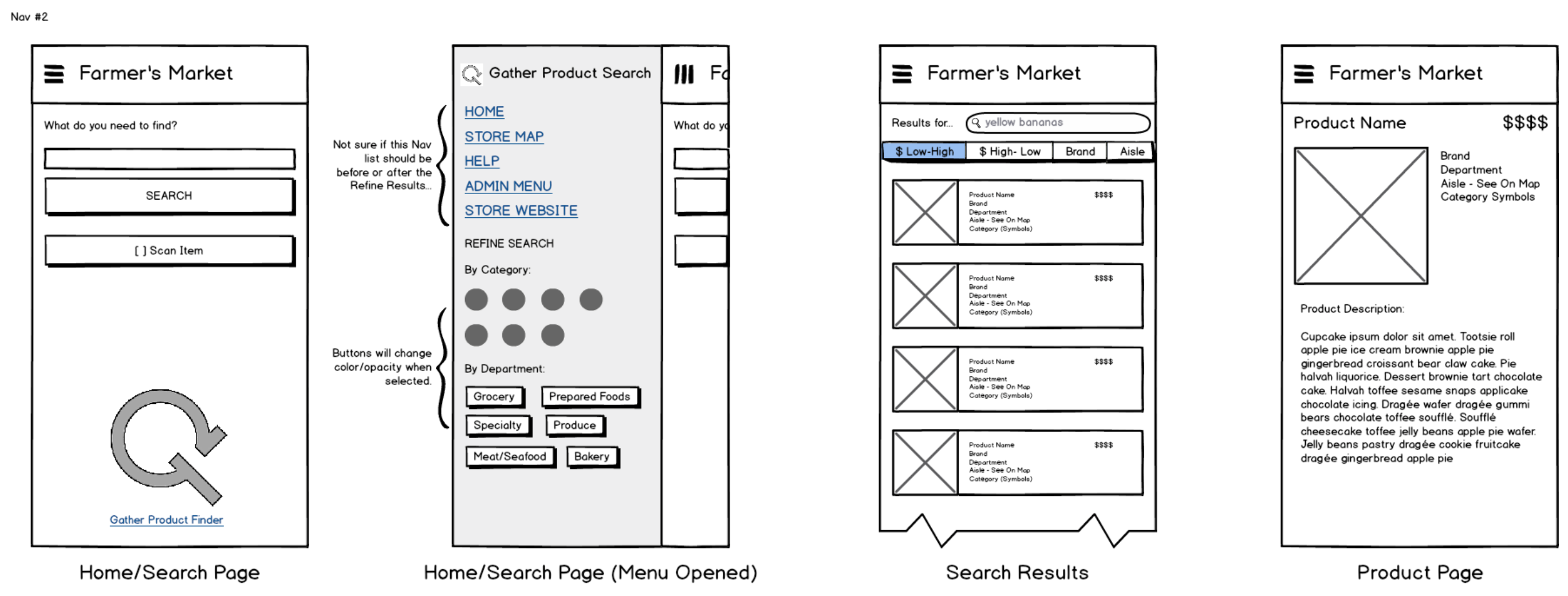
Product Cards now are full width of the screen, allowing more room for product information and larger images.
Search Results

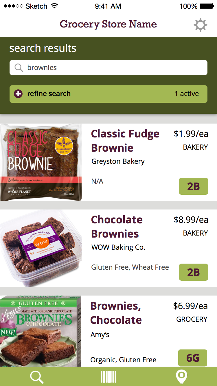
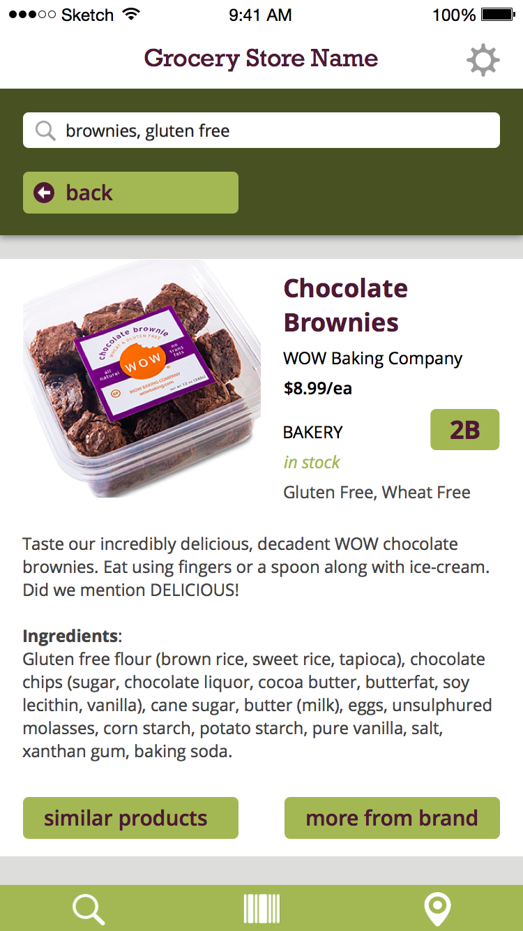
Product Detail Pages are full width as well and now includes if the item is in-stock or not. Still debating if this should be included on the product cards as well.
Product Page

Mockups with Interactions

For this last round of mockups, I added a lot more screens and described the interactions between them in detail. Doing so brought up some usability and visual issues I had yet to really deal with. For example, on the map page I have “back” and “next product” buttons which made perfect sense at the time but now seem kind of odd. I’m going to have to re-visit the functionality of them and see if they still make sense. I am displaying all the search results on the map anyways so when would users need to see the next product?


Wireframes v1

Here are the first version of wireframes for my new home screen layout, I changed things up quite a bit from my initial design. This version provides more features with better functionality and user experience overall. I am able to provide more filter categories and department options by having a dropdown menu with checkboxes. This means that as new dietary fads and trends appear, which they will, the store can add them without having to redesign of the entire home screen. Doing so freed up a lot of space on the front page for new products and seasonal items, furthering employee product knowledge and discovery.

wireframes_update garcia


I included my old home/search screen as a comparison:

home screen